
The Most Dangerous Mistake in Data Analysis
A deep dive into the statistical trap that misleads scientists, policymakers, and everyday thinkers
Imagine you’re a public health researcher who just found something remarkable. In every city you studied, the number of swimming pools has a near-perfect correlation with the rate of drowning deaths. You run the numbers again. The relationship holds. So you draft a bold policy proposal: ban backyard swimming pools to save lives.
Sound absurd? It should. Because what you’ve discovered is that both pools and drownings increase in summer, in warmer climates, and in wealthier neighbourhood’s. The pools didn’t cause the drownings. A third factor heat, season, geography drove both. You made the single most dangerous mistake in data analysis.
You confused correlation with causation.
“Correlation does not imply causation” but every year, millions of decisions are made as if it does.
First, Let’s Define the Terms Clearly
Before we go any further, let’s get the definitions right because surprisingly, a lot of people mix these up even at a conceptual level.
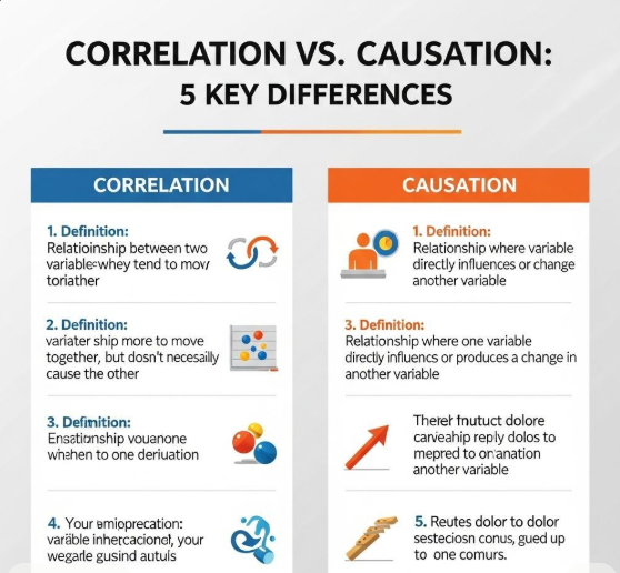
Correlation is a statistical measure that tells us two variables move together. When one goes up, the other tends to go up (positive correlation) or down (negative correlation). It’s purely observational. No judgment about why. No mechanism. Just a number between -1 and +1 that tells you how synchronized two things are.
Causation means one thing directly produces, triggers, or influences another. There’s a mechanism. An action leads to an outcome. Cause comes before effect in time, and the relationship holds even when you control for everything else.
The gap between these two ideas is not semantic. It is enormous. And bridging it incorrectly has cost lives, wasted billions, and produced policies that did the exact opposite of what was intended.
Why Our Brains Are Wired to Get This Wrong
Here’s the uncomfortable truth: we are biologically built to see patterns where none exist. It’s called apophenia and for most of human history, it kept us alive. Hearing a rustle in the bushes and assuming predator (even when it was just wind) was a smarter survival strategy than doing a statistical analysis.
But that ancient survival instinct becomes a cognitive liability in a world flooded with data. When two things happen together repeatedly, our brains don’t shout correlation they whisper cause. And that whisper feels like insight.
Key Bias: This is known as ‘illusory correlation’ the tendency to perceive a relationship between variables even when the statistical evidence is weak or nonexistent.
Add to that our love of narrative. Causation makes a story. Correlation is just numbers. When a journalist writes ‘People who eat breakfast are more successful,’ it reads like advice. The alternative ‘Breakfast consumption is correlated with success-related variables, possibly through socioeconomic mediators’ doesn’t sell papers.
The Anatomy of a Spurious Correlation
Tyler Vigen, a Harvard Law student, built an entire website dedicated to spurious correlations — statistically real relationships that are obviously meaningless. A few favorites:
- The divorce rate in Maine correlates almost perfectly (r = 0.99) with per capita consumption of margarine.
- Nicolas Cage film releases correlate strongly with swimming pool drownings.
- US spending on science and technology correlates with suicides by hanging.
These are funny. But they illustrate something deadly serious: if you torture data long enough, it will confess to anything. With enough variables and enough data points, you will find correlations. The question is never whether the correlation exists. The question is what it means.
“With enough variables, any two things can be correlated. The universe is under no obligation to make sense to you.”
The Four Explanations for Any Correlation
When you observe that variable A and variable B are correlated, there are exactly four possible explanations. Knowing these by heart will make you a sharper thinker than 90% of people who read data:
1. A causes B. This is causation. The relationship is real and directional. Smoking causes lung cancer. Exercise improves cardiovascular health.
2. B causes A. The direction is reversed. We might assume that happiness leads to success, but it may be that success leads to happiness or both are simultaneously true.
3. C causes both A and B. A third variable, often called a confounding variable or confounder, drives both. Ice cream sales and drowning rates both go up in summer. Summer (C) causes both. This is the most common real-world error.
4. Coincidence. Especially in large datasets, random correlations emerge naturally. If you measure 1,000 variables against each other, you’ll find dozens of ‘significant’ correlations purely by chance.
Rule of Thumb: Before declaring a causal relationship, you must be able to rule out all three non-causal explanations with evidence, not intuition.
Real-World Disasters Born from This Mistake
This isn’t an academic problem. The correlation-causation confusion has shaped history sometimes disastrously.
The Hormone Replacement Therapy Catastrophe.
For decades, studies showed that women who took hormone replacement therapy (HRT) had lower rates of heart disease. Researchers concluded HRT was cardioprotective. Millions of women were prescribed it. Then came the randomized controlled trials and they showed the opposite. HRT increased cardiovascular risk. What happened? Women who chose HRT were healthier to begin with (selection bias). The correlation was real. The causation was completely backwards.
The Education-Earnings Trap.
‘Go to college and you’ll earn more.’ The data shows a strong correlation. But critics argue that the people who complete college are already more driven, better networked, and from higher-income families. Colleges may be selecting for success rather than creating it. The correlation is robust. Whether college causes the earnings gap or whether it’s signalling, selection, and social capital remains genuinely contested.
The Gun-Violence Debate.
Both sides of this debate cherry-pick correlations that support their position. More guns = more deaths? Or: stricter laws correlate with more crime? What they’re both ignoring is that correlation in observational data involving human behavior is an analytical minefield. Culture, law enforcement quality, poverty, urbanization all confound the picture. Data without causal structure is just noise with a narrative attached.
How to Actually Establish Causation
So if correlation isn’t enough, what is? Here’s the toolkit that serious researchers use to move from ‘things are related’ to ‘one thing causes another’:
Randomized Controlled Trials (RCTs). The gold standard. Randomly assign subjects to treatment and control groups. If you randomize properly, confounders wash out. What’s left is causation. The challenge? RCTs are expensive, slow, and often unethical (you can’t randomly assign people to smoke for 20 years).
Natural Experiments. Sometimes the world creates its own randomization a policy that changes for some cities but not others, a scholarship lottery, a sudden law change. These create quasi-random variation that allows causal inference without a lab.
Regression Discontinuity. Used when there’s a threshold like a test score cutoff for a program. People just above and just below the cutoff are nearly identical, making comparisons between them surprisingly clean.
Instrumental Variables. Find something that affects A but has no independent effect on B. Use it to isolate the causal channel. Technically demanding, but powerful.
Bradford Hill Criteria. Developed for epidemiology, this is a checklist of causal evidence: strength of association, consistency across populations, biological plausibility, dose-response relationship, and so on. No single criterion is decisive, but the full picture can be compelling.
The Questions You Should Always Ask
Whether you’re reading a news headline, a scientific study, or a business dashboard, train yourself to ask these questions before accepting any causal claim:
- What is the actual study design? Observational data can’t establish causation the way controlled experiments can.
- What confounders might explain this? Who or what else could be driving both variables?
- Is there a plausible mechanism? Can anyone explain how A would actually produce B?
- Was the correlation discovered before or after looking at the data? Post-hoc pattern-finding is the engine of spurious findings.
- How large is the sample? Small samples produce wild correlations by chance.
- Has it been replicated? One study is not science. A pattern that holds across populations and methods is something worth taking seriously.
A Note on Correlation’s Legitimate Power
We shouldn’t throw the baby out with the bathwater. Correlation is genuinely useful — it’s just not sufficient on its own.
In medicine, correlational evidence was the first signal that cigarettes were dangerous. In economics, correlations between leading indicators and GDP help forecast recessions. In machine learning, models built on correlation alone with no causal understanding predict user behaviour, detect fraud, and translate languages with startling accuracy.
The lesson is not ‘distrust correlation.’ The lesson is ‘know what it is and what it isn’t.’ It’s a signal worth investigating. It is not a conclusion worth announcing.
“All correlation tells you is where to look. Causation tells you what’s actually happening.”
The Takeaway
We live in the most data-rich moment in human history. Sensors, apps, databases, and algorithms are generating more information every second than humanity produced in its first few thousand years. And with that flood of data comes a flood of correlations beautiful, seductive, misleading.
The ability to distinguish correlation from causation is not just a statistical skill. It is a form of intellectual honesty. It is the refusal to be fooled by patterns that feel meaningful but aren’t. It is, in a very real sense, the foundation of rational thinking.
The next time someone tells you that X causes Y, ask them: how do they know? Ask what the study design was. Ask what else might explain it. Ask whether anyone has tried to replicate it. Ask whether there’s a mechanism.
Ask, in short, for more than a correlation.
Because the most dangerous mistake in data analysis is also the easiest one to make and the one that almost nobody teaches you to avoid.